After early research confirmed a need for an organized, image-based location database, my task was to synthesize these findings, and define what that actually looked like in practice. I worked with Locale Scout’s founder and visual designer to translate insights into a cohesive product experience, shaping the structure, interactions, and visual hierarchy for the location detail and gallery flows.
CONTEXT
Managing hundreds of location photos, notes, and logistical details scattered across drives, PDFs, and messaging apps.
PROBLEM
UI/UX Design, Research, Product Strategy, Ideation, Prototype
SKILLS
To design a single, cohesive image library for locations, that could hold both the creative and the practical sides of a location, from inspiration to shoot readiness, without overwhelming the user.
GOAL

LOCALE SCOUT: A LOCATION BASED IMAGE REPOSITORY
Who we’re designing for
USER SEGMENTS
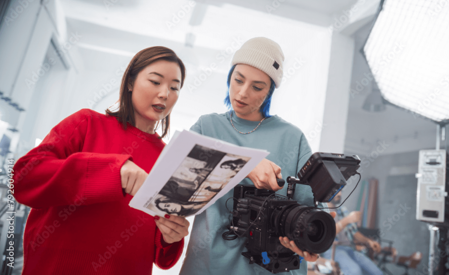
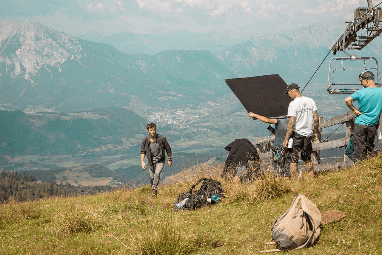
Location scouting isn’t done by one kind of person, it’s a layered practice that stretches from large film crews to solo creators chasing the perfect shot, from content creators seeking aesthetics and atmosphere to bird watchers balancing detailed notes with beautiful imagery.
Diverse users with a shared need:
A place to store, describe, and rediscover visual locations with ease.

The Default User (MVP Focus)
Ex: Film Professionals
The New User
Their Team
The Mature User
Professional Location Scouts
Directors, producers, and assistant directors who need to reference, compare, and organize locations for active projects.
Crew members, art directors, and coordinators who collaborate on decisions, add notes, or check feasibility in real time.
Industry veterans with large personal archives and refined systems for tagging, cataloguing, and sharing, seeking powerful search and AI-supported organization.
“I have thousands of photos scattered across drives. What I really need is one place that actually understands how I think about locations by look, logistics, and vibe.”
Understanding the world of location scouting
01
Crafting the persona
02
User journey
03
Product features and functionalities

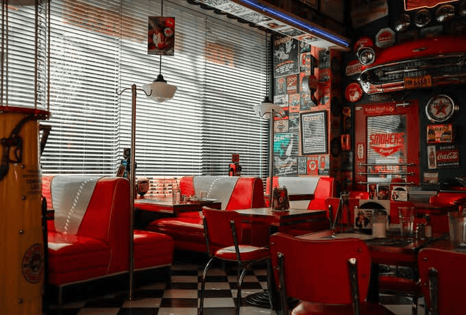
Warehouse Studio — Los Angeles, CA
Late-afternoon natural light spills through high arched windows, hitting textured brick walls and open industrial beams.
#IndustrialWarehouse #NaturalLight #ExposedBrick #FilmSetReady #OpenFloorPlan #HighCeilings #ConvertibleSpace #DowntownLA #1980s Urban
Phase 1 : Research
Understanding the world of location scouting
01
Comparitive and Competitive analysis
02
Learning from creative libraries
03
Sketching it out
04
Wireframes and Iterations

Phase 2 : Concept
Bringing cohesion to the experience
01
Design decisions
02
Prototype
03
Next steps
04
Metrics
Phase 3 : Final Design
Alex, the storyteller
Alex’s physi-digital journey
Our focus:
An organized location database
My focus:
Location detail + gallery flow
PERSONA
PERSONA
CAPABILITIES
CAPABILITIES
“When I’m location scouting alone, I want to upload and tag my photos with emotional or narrative notes, so I can remember what each place felt like for the story.”
When I’m collaborating with my crew, I want to create and share curated collections of location photos with notes, so everyone can visualize and give feedback without confusion.
When I’m planning a scene, I want to compare a few locations visually and contextually, so I can choose the one that fits both emotionally and practically.

A young independent filmmaker who often scouts and manages locations herself before bringing in her small crew.
Goal
Goal
Priority
User Stories
To quickly organize, tag, and share location photos to make creative and practical shoot decisions.
To quickly organize, tag, and share location photos to make creative and practical shoot decisions.
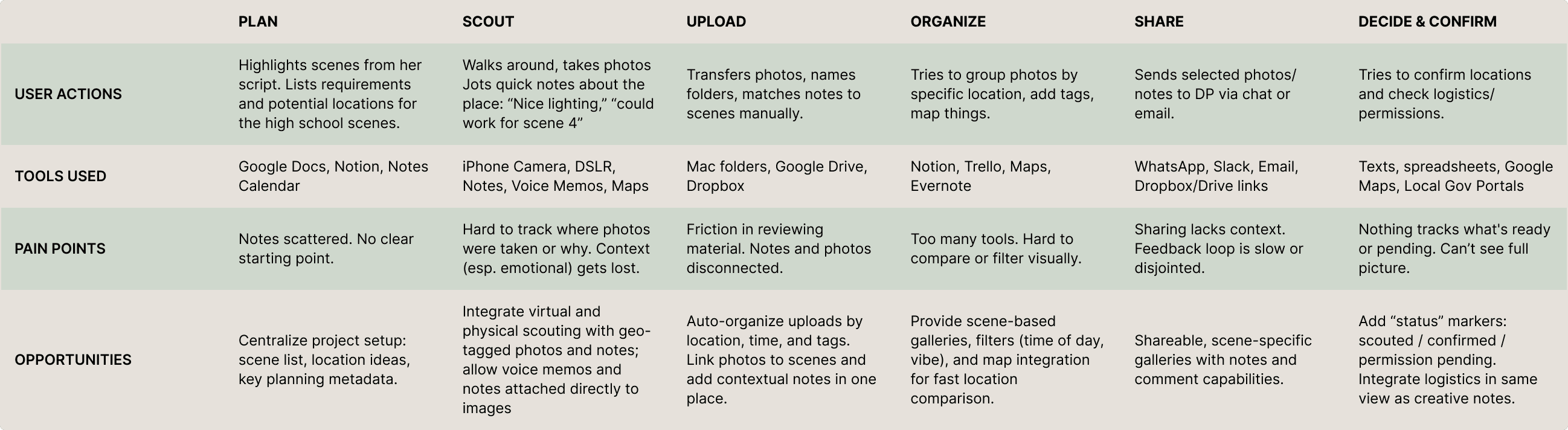
From our research, we defined what the product needed to do before what it should look like. This phase mapped how users move across locations, projects, and libraries, forming the system’s core flow and product structure.
Focusing on the Location Detail and Gallery flows, we shaped how locations become production-ready assets. This work helped define requirements and clarify the product’s key features, user interactions, and content structure, connecting creative and logistical needs in one place.
Visual organization | Emotional tagging | Easy collaboration


Understanding the Landscape
Finding direction
Comparitive and Competitive analysis
Wireframes and Iterations
Before defining what Locale Scout could be, I studied how others organize locations- direct competitors like Location Scout to commercial spaces like Airbnb, Giggster.
These systems showed how location data is populated, organized, and visually presented.
They helped identify conventions users were familiar with and the friction points we could solve in this context.
While creative tools start from a blank page, location scouting followed routine process.
The final concept merged structured viewing with creative flexibility; pairing a detailed, scrollable Location Detail page with a connected Gallery view for easy context switching.
This set the foundation for the final design: intuitive to start, layered enough to grow, and designed to hold complexity without overwhelming the layout upfront.


Conventions and Patterns
When your library
becomes your Workspace
For an easy, confident
first step
Sketching it out
The location detail page had to be designed to make that first step easy, to overcome that “blank page” hesitation, giving users a place to start easily, build naturally, and see progress right away. These sketches helped test navigation hierarchy, tagging models, and the relationship between the detail page and gallery before committing to layout decisions and helped me quickly visualize how it all came together.
Learning from creative libraries
Next, I looked at how image-first tools organize large visual collections, from 500px and Flickr, to ShotDeck and creative tools like Adobe Bridge and Figma.
This phase explored the structure of creative tools rather than platforms: folders on the left, metadata on the right, a rhythm also echoed in Spotify’s library layout.
The insight: our users think more like creators than browsers. Their process is visual, layered, and personal.


Check out detailed iterations
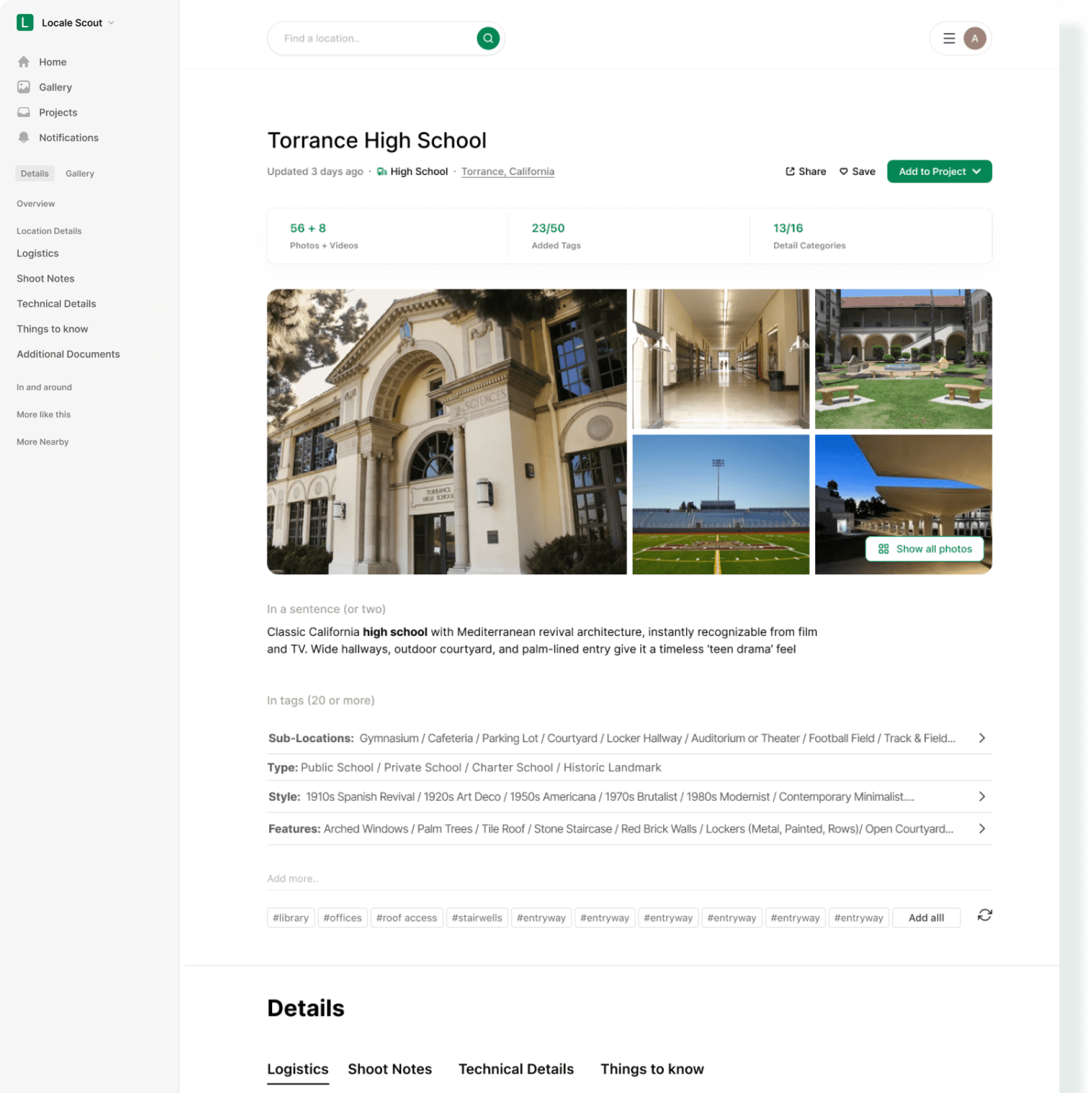
Header - Setting the stage
Final Design
Left Navigation
Keeps orientation simple and familiar. Users can move between their Gallery, Projects, and active Details view without losing context.
Title & Location Info
Shows key metadata upfront — location name, type, and city, all pulled from the upload flow for seamless continuity.
Quick Stats Bar
Summarizes how complete the location record is, number of media files, tags, and documentation progress.
Gallery Preview
Displays the main image chosen by the user plus contextually relevant thumbnails (latest updates or related search).
‘In Two Lines’ Description
A concise narrative snapshot, what the place is, how it feels, and where it could fit in a story.


System Generated
User Generated
API Generated
AI Generated
Documenting the location - Context in structured layers
Final Design
Structured Tag System
Organized by sub-location, type, style, and features, each tag doubles as a visual filter.
Smart Tagging & AI Suggestions
Users can freely type tags with autocomplete suggestions. AI-generated tags appear below, ready to be accepted or refreshed and evolve as users upload more media, refine their notes.
Detail Header Tabs
Template of industry-standard categories, balancing structure and flexibility to create a familiar mental model for film professionals.”
Detail Components
Expandable, movable, and editable blocks. Six shown by default, with “Show more” to expand.
Designed like creative notes, not rigid forms to support user agency while staying organized.


System Generated
User Generated
API Generated
AI Generated
Next steps- Keeping the momentum
Final Design
More Like This
A row of visually similar or contextually related locations, drawn from shared tags, metadata, and visuals that helps the user quickly compare or expand their options within tone and logistics.
More Nearby
List of nearby scouted or public locations (within a user-set radius). API-fed results that leverage geo data to show what’s accessible for the same shoot day that encourages building clustered production days (ex: 2 Fremont locations within 20 km).


System Generated
User Generated
API Generated
AI Generated
Real- time logistics and live conditions
Final Design
Practical Details
A quick-access summary for practical considerations such as contact Information, permit Requirements, and cost highlighting what producers and coordinators look for first.
Attachments
Upload and store key documents to centralize all location collateral so teams never lose critical reference materials.
In and Around
An interactive map with live data, and API generated, useful information for the user such weather, coordinates, golden hour timing, and more to turn the location into a live environment, instead of a static record generated just by the user.


System Generated
User Generated
API Generated
AI Generated

Adoption & Engagement
60% of new users upload at least one location in their first week

Content and AI Quality
80% of locations have at least 5 tagged images and Avg. of 15+ tags per location (driven by AI assist and user tagging)

Collaboration & Retention
50% of users share or link a location to a project
Final TARGET METRICS
MVP goal → “To make the platform feel smart enough to guide, light enough to just start.”
Next steps- Test & refine
Research
Concept
Final Design
Testing
Deploy
Location Detail Page
Validate structure, usability of tagging, and edit behaviors
Is the flow intuitive to fill and revisit?
Gallery Experience
Observe browsing and tagging interactions
Evaluate findability and visual organization patterns.